
Tips For Your Substack Home Page
A few tips that will help you get more people to stick around to check out your writing instead of looking and leaving

Here’s a funny tidbit you may not know. Back in 2002, a behaviorist at Harvard decided to see how people judge websites and webpages. Like, how they decide whether to stick around and check it out, or just nope out and leave.
His name was B.J. Fogg and he had his own ideas about how people behave online and wanted to prove he was right. He thought when people found a new website that they’d poke around and read some stuff and then decide if they like it.
Turns out he was wrong. That’s not what people do. Not at first, anyway.
At the end of the study, he said he didn’t want to find this in his research, but the truth of the matter is that people take one look and judge based on what they see. If it looks visually interesting, then they poke around. Otherwise, they leave.
It’s not so different than saying don’t judge a book by it’s cover but we do.
After that, other people did more studies to add context. Like, a study out of Toronto tested to see how fast people leave. lol. (They leave skid-marks.) And another study looked at what factors make people curious enough to stick around.
As you might guess, there’s a lot of things from appealing visuals to familiar faces to topics and even social proof. People are just looking to see “is this for me?”
Much like book covers, we do the same with websites, too. I don’t need to tell you that your Substack page is a website, right? I’d forgotten about that old study until I was on Notes, saw a note that caught my eye and clicked to check out the Substack.
The image in the middle of the page was one I’ve seen at least a hundred times on Medium because it’s the first result on Unsplash. The right column was ‘top posts’ so I hovered and noticed the top post had 4 hearts and no comments and by the third one, there were no hearts. I was, like — oh hello, B.J. Fogg, I remember you. lol.
Because I know what “most” people will do. They’re going to look and leave. Because nothing visual stands out and there’s not much reader activity. Lack of social proof.
I wanted to tell the owner of that Substack to switch from Newspaper layout until her top posts have some traction because it’s going to cost her views because that’s how social proof works. But that’s about as rude as commenting on someone’s writing to correct their grammar so I didn’t say anything. Decided I’d write about it instead.
Substack has a whole tutorial on homepage design, so I won’t go through every step of it, but wanted to point out a few things that might be helpful to catching readers so they stick around long enough to have a look at your writing.
If you’ve never edited your design you find it at:
Setting > Website Design > then click “go to website theme editor”
A few notes in the basic layout…
First thing note is in the basic setup, options change depending on what you select.
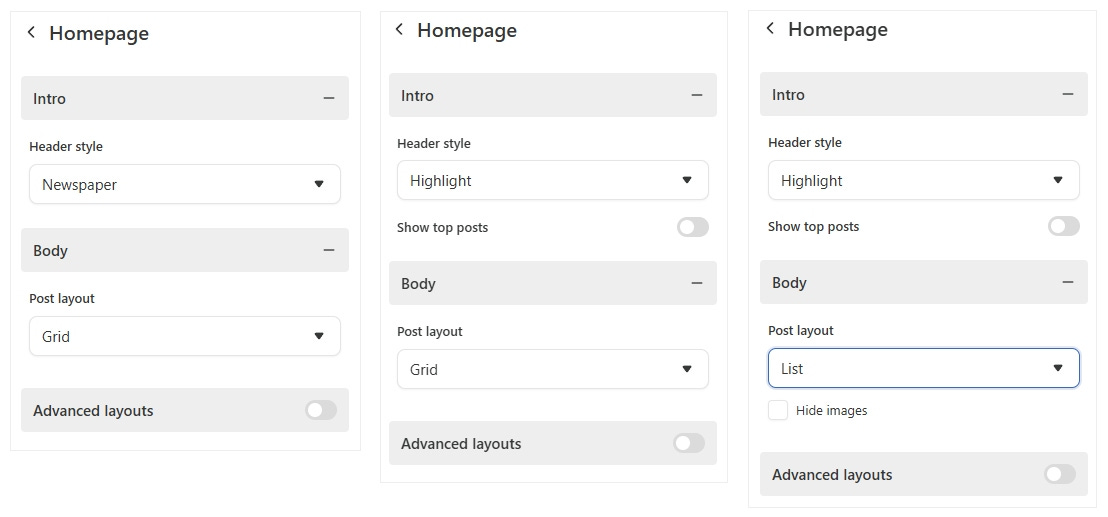
For example:
If you choose Newspaper layout, you can’t toggle whether top posts show or not because they’re built into the Newspaper layout. So if you’re new and don’t want to broadcast to the world that your “top post” has three views, choose a different layout than newspaper so you can toggle top posts off. :)
If you have a few top posts that did super well, make sure to toggle top posts ON. People will see those, click in to read and that’s what you want.
In the body, where your posts go, if you choose to list your posts as a list, you can turn images off and have titles carry the heavy work if you want to. If you choose grid, your posts will have the image with title under it.
Always lean towards visual appeal. If your images scream “tabloid” use the list format so your page isn’t so shouty. If your images add to the aesthetic, go with grid.
Advanced options are gold…
If you’ve never checked out the advanced options, do! There’s gold in there.
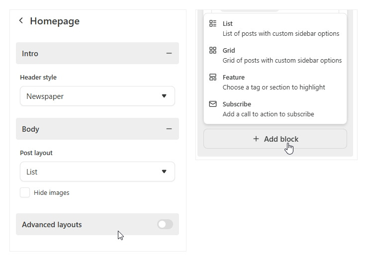
If you don’t have advanced layouts turned on, just toggle them on. Then you’ll get an option that says “Add Block” — you’ll be able to choose from four options.
List, Grid and Feature let you separate your content into sections by topic. They also offer sidebar options. So you can do recent posts and top posts — or list content by topic/tags and decide what you want in the sidebar.
Subscribe: lets you drag a signup bar and you can customize what it looks like. I use those in between sections on my homepage and they really work.
Here’s the power of the advanced options. If you write on multiple topics they never have to get lost and your new visitors will know what you write about at a glance.
That’s a big one for me because I write about so many things from literature to writing, sharing my journey as a writer, I write tips and tutorials on the tech behind platforms like Substack and Medium. Being able to section those out is great.
Play with the subscribe bar!
I’ve seen some Substacks that are really clever with the subscribe bar. For example:
Paste in your best review (preferably short) with a subscribe button
The title of your top post followed by the subscribe button
Thank you to XXX readers for supporting (your Substack name) with sub button
A quote that encapsulates what you’re about — with subscribe button
Think of the subscribe bar as your own tiny “note” on your homepage. Something short and catchy, followed by a signup button. They really do work
Sections vs Tags..
One thing that confuses a lot of people is the difference between “sections” and “tags” so I want to explain those. When you add a “block” to your homepage, Substack gives you three options. Recent posts, tags or sections.
Recent posts is self explanatory.
If you choose TAGS, you can choose one of your tags and Substack will fill the block with all the posts that use that tag. For example, one block for book reviews, another block for poetry, another for personal essays — or whatever fits the content of your Substack. You’ll probably need to edit posts and clean up the tags if you’re finding posts showing up in multiple blocks.
If you choose SECTIONS, think of those like mini-newsletters. Because when people go to subscribe, they’ll be able to subscribe to “all” to get all your emails. But they can also subscribe or unsubscribe from sections separately. So if they want posts from your history section but not your politics, they can do that.
Important takeaway: Sections and tags both let you sort content into groups, but “sections” each have their own signup. Tags do not. So if you have content that maybe not everyone will want, make it a “section” so readers can opt out of that. If you don’t want any content to have it’s own subscribe/unsubscribe option, go with tags.
Hope that was helpful. If you haven’t played with design options, I hope it will make you curious to go poke around. Did I miss anything? If you have questions, or there’s something you missed and I didn’t cover, let me know in comments.

You've inspired me to take your advice and get to work!! :) xoxo
Thank you for the advice.